
This week I felt quite compelled to explore more flowers after realizing that I am completely at a loss for what to do when working in this subject with watercolor. I played around a bit without clear goals but then tried a couple of specific things. Of course, it helps that everything is starting to bloom around me.


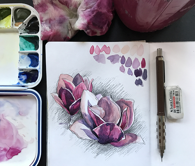
As with most things I create, I love to start with simply drawing my subject. My pencil allows me to see more accurately and the familiarity that comes from this process makes painting so much more successful. Of course, as an drawing professor I am a little biased with the impact that the drawing process can have but… it really does matter!


Color studies with the new palette are also a great place to work from. I’m starting to feel more at home with the colors I’ve chosen and the more I try to apply them to the subjects I’m painting, the more confident I become with my choices. While I’ve found myself using some colors far less than I would have anticipated, I’ve also begun to rely on others more – specifically Quinacridone Coral (who would’ve thought?!).
Part of what has bothered me the most lately is how dark I usually get with my watercolors. I believe that a lot of this stems from my over-reliance on using grisaille under-paintings but I think that my love of contrast also reinforces more heavy applications of darker layers towards the end of my work.

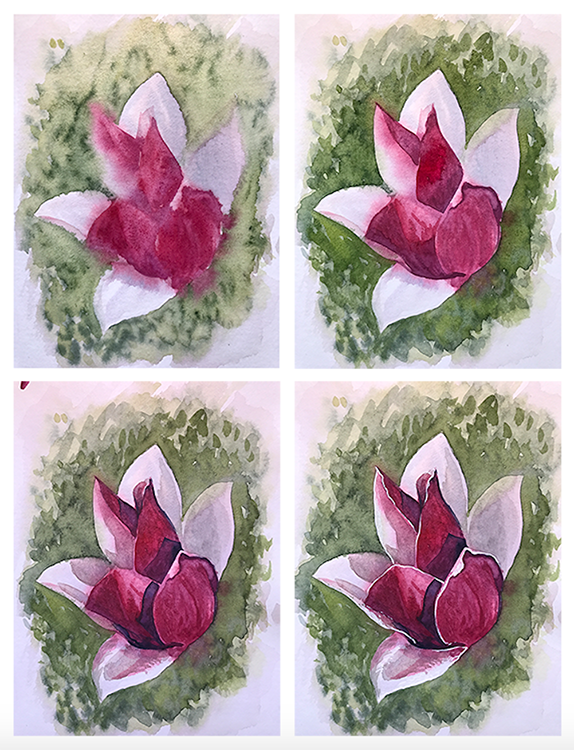
In this study I tried to “lighten up” a little bit while retaining some of my personal aesthetic. While there is darkness, I like the balance that was achieved is a little better than last weeks little roses. The midtones got muddy though – I needed to handle them better overall. I think that I should work on tackling this through color use more than anything.
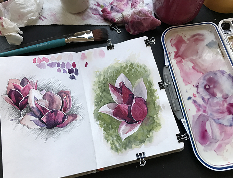
After watching a lot of videos of various artists painting flowers, I decided to attempt a fully wet-on-wet start to a painting. This was a bit more challenging than I remembered and in the first couple of minutes I quickly remembered why it has been so long since I’ve used this type of process for anything other than backgrounds. I was too distracted to document the first part but happily I did figure out how to work with more moisture in my Global Art watercolor sketchbooks as I started to work back into the piece as the paper dried.
When fully saturating the back and front of a page and securing it around all 3 edges with binder clips I was able to simulate a mock-stretch that helped ensure a flatter outcome as the work dried. I think that preparing paper for other types of paintings (even with less water) will maintain the overall quality of the final painting.
Although I’m still not really happy with the results I’m at least feeling a little more confident in identifying some of the possible directions that I will want to explore more. More flowers next week… and shells…

beautiful paintings and colors
Thank you so much, taphian!
Beautiful pictures!
Thanks!
Thank you for the support.
Very pretty, love your work!! Beautiful colors 🙂