
As a companion to the Flower Identification poster that I’m working on, I’ve started crafting one for leaf arrangements. As the following work is my inspiration, I thought I’d start the process by creating an homage to the original by illustrator Margaret Senior (source).

While The Patterns Method of Flower Identification has certainly been helping me learn about all things “flowers”, foliage is an entirely different story.

The more I worked on my more straight-forward master’s study the more I realized I didn’t know about the labels for each item. Because I want to know why certain things are related (yet different) I have to start a back at the beginning to learn the basics of botanical terminology for leaves too.
In my own version, I’ve inverted the tree as the result of creating the drawing upside down in the normal order of my botany sketchbook. It made more sense to label it this way instead of tear it out. I tend to love drawing my plants upside-down and this chart is just for me anyway.

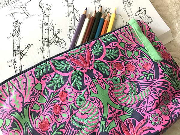
I ordered a copy of The Botany Coloring Book as a fun way to creatively and visually explore these terms and it is helping a lot – both as a reference and a fun way to unwind in the evenings (especially if I’ve spent all day on the computer grading and don’t have the energy to draw). It doesn’t hurt to have such an awesome neon William Morris embroidered pencil case and erasable Prismacolor pencils to color with.
I’m trying to re-envision this data listed by Senior for a US audience as this illustration was originally created for an Australian identification book. I continue to add different things into the graphic as I go. To make this easier, I’ve begun to catalog all of these options based on vintage illustrations using Photoshop. 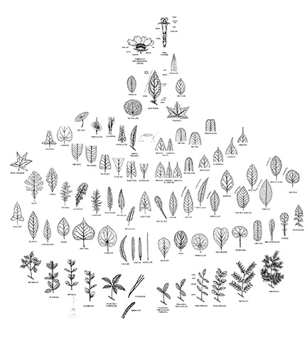 By creating a layer for each item, I can constantly add and rearrange items until I’m happy. The resulting mock-ups will then provide some good information from which I can base my continued research and development of the remaining poster.
While I kept with the rainbow themed color scheme of the flower identification study for the final version of my study, I don’t plan on maintaining this in the final (at least for this specific poster). I will try to keep more of the original colors of the leaves and plants selected this time around. There is so much variety in coloration in foliage though it will be far from dull (especially with birds and butterflies peppered in).

Note: I am not affiliated with any of the items linked in this post and am not compenstated for my endorsement or commentary in any way.

1 comment