
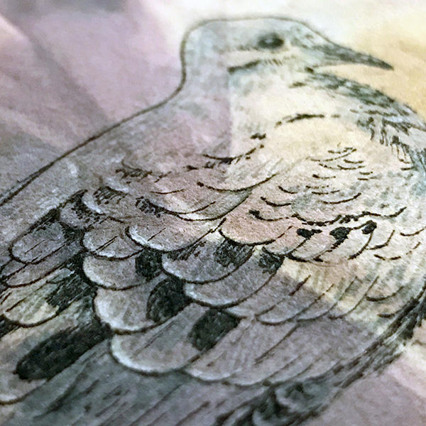
With the success of my eco-print papers last week I instantly wanted to draw and paint back into for Week 37 of my 52 week art challenge. I decided to apply some of the stylistic techniques I’ve been exploring with botanical illustrations on mixed media panels. The principles of positive and negative space in these previous studies seemed like they would be conducive to the beautiful subtle tones and suggestive plant imagery on the eco-prints.
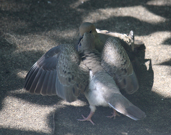
I chose to create a drawing of my favorite local Mourning Dove, whom I call Simon. Simon reached maturity in our back yard with the help of his doting (and quite tolerant) mother. Throughout the previous months, he has grown into a lovely young bird and is the subject of much of my backyard photography.

I’ve been learning how to identify the individual birds that frequent the feeder and plants off my porch. Both my studio and the living room area look out over this location and afford great views of the ongoing saga of the birds. My husband has been encouraging me to illustrate their birdy adventures – it seems I talk about them a lot when prompted with “how was your day?”.
In preparation for Inktober, I thought about completing drawings that not only explored this concept but also utilized the eco-print paper, however, after working on the surface awhile I came to a few conclusions. For one, the soft printmaking papers I used (BFK primarily) – while excellent for the eco-prints themselves as they can tolerate boiling – are not suited for ink work with technical pens.
If you’ve never had the chance to draw with a technical pen I should explain that they use a wire nib in a barrel and the wire nib touches the paper. Any real toothiness or fibrous quality in a paper surface is generally not conducive to technical pens because it lends to scratchy catches. As I also love to use water-media in my ink work, I generally choose hard press or very tightly compacted cold-press papers for my artwork.
Because I had issues with my .35 mm Koh-I-Noor Rapidograph pen catching on the surface I began working with a .3 mm Micron pen and had much greater success. The felt-tip nature of the Micron pen worked well. I like Micron pens when I travel (tech pens don’t always seem to do well on planes and garner some interest in TSA at times) but in my illustrative work I greatly prefer the use of a technical pen.
In addition, I explored the use of a sepia-like ink with a brush, a white (Pentel) gel pen, white gouache, and watercolor. I wanted to maintain the beauty of the eco-print so these were applied minimally.
While I am happy with the small painting that I created, the media experience left a little to be desired. I was also not comfortable with the absorption rate of fluid ink applied with a brush and more viscous gouache and water color as the bleed wasn’t easy to anticipate and therefor control.
Regardless, I loved the little tribute to Simon so much I decided to make the painting into a birthday card for my mom.

I used a ready-made printmaking card and simply cut a window in the front to act as a mat. I used colorful (and gentle) washi tape to secure Simon in the right place. This will allow my mom to pop out the painting if she chooses to put it in a frame later on. Of course, I have to schedule this post after she’s sure to have gotten her package so this post will naturally be a little delayed – worth it I think to not ruin the surprise. 🙂
HAPPY BIRTHDAY MOMA!!! I LOVE YOU SO MUCH!!!

