Well, one week wasn’t enough to get my palette in order. I thought about titling this post something different like “Staying sane while charting your watercolor choices” or “How do Daniel Smith and M. Graham watercolors stack up?” but sometimes it’s best to just say “part 2” and be done with it.
At the end of last week there was simply too many choices left to me and I had just ordered 8 new tubes that I’d yet to try out. The more I started to explore the types of color combinations that were possible the further I went down the rabbit hole. As a result, I decided to dedicate all of week 2 to the completion of my efforts so that I can get started on other things from Week 3 forward.
Disclaimer: This post gets very technical and goes the various combinations of different paint manufactures and colors – this is more to document what I discovered and isn’t intended to be used as a guide for beginners. I doubt that any beginner is really concerned with much of this stuff anyway – I wasn’t. But for the more advanced painter who’s looking to upgrade to more professional paints while still maintaining a few of their current student-grade tubes, this just might be helpful.
I researched a lot of different types of color palettes on Pinterest to try to figure out if there was some magical way of making the journey a little less time consuming but, alas, it seems that it just takes a lot of patience and a willingness to fully throw yourself into the process no mater what you decide to do personally. There is no escaping the color chart sometimes. Despite some really creative artistic options out there, I stuck with tried and true grids for my charts – I’ve always loved grids.
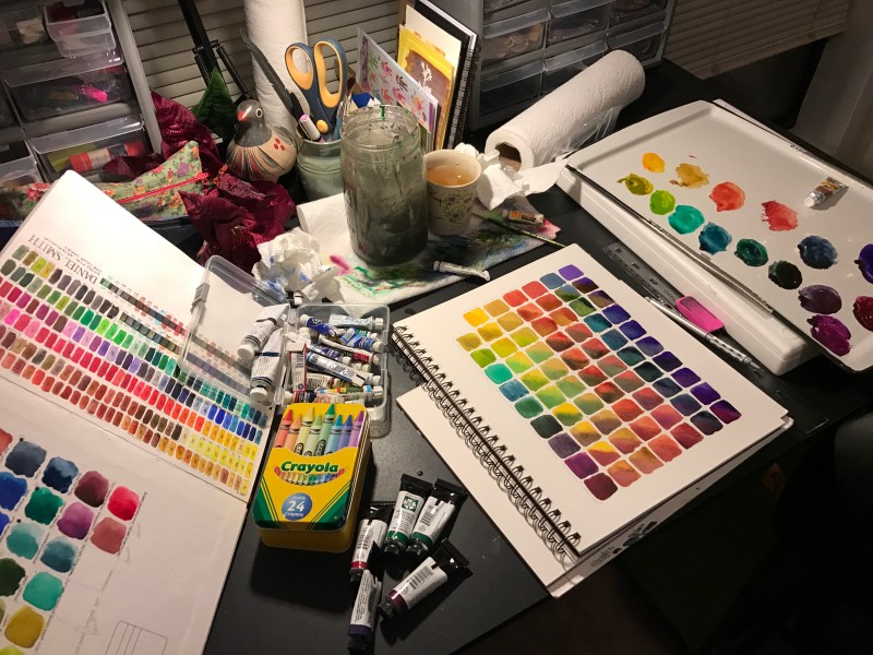
I am working in a Canson Montval Watercolor Sketchbook to document all of my various palette explorations. I like that it is spiral bound so that I can use this as a handy reference in the studio whenever necessary. While I was disappointed that this paper is poorly prepared on the back of the page (making it not conducive for my charts), I later discovered that only working on the front side of each page is ideal. As I continue to add more I can reference previous pages by peeking under the stack without disrupting the current page I’m working on. I also paint on Canson Montval Watercolor blocks about 95% of the time so this helped to ensure similar outcomes (though I do not think they are equal, the blocks are far superior still in my book).
When I started to explore my colors I began with the colors I most associate with my current “palette” (for lack of a better term) – primarily the colors I first learned with plus a few here and there that I just happened to find myself using a lot. These colors consisted of tubes like: Alizarin Crimson, Cadmium Red Light, Cadmium Yellow Light, Lemon Yellow, Light Yellow Green, Yellow Ochre, Olive Green, Thalo Green, Thalo Blue, Ultramarine Blue, Cobalt Blue, Burnt Sienna, Paynes Grey, and (personal favorites) Indigo and Quinocridone Burnt Orange.
I was taught that these were the basic building blocks of any good watercolor palette and I still adamantly believe that this is true. These are amazing colors to incorporate and build upon. My curiosity had me questioning whether or not these are the right colors for me right now, not if they were “good” colors at all.
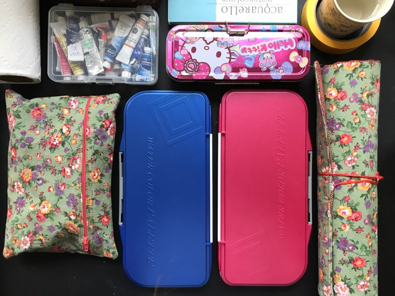
The first thing to look at then, was what types of colors were missing from my range and what new and exciting alternatives are available to potentially replace some of the colors that just aren’t ringing my bell anymore. The tubes that I purchased from Daniel Smith (after testing their 238 sample card in person) helped to fill in some gaps. The new colors I bought are: Green Gold, Rich Green Gold, Mayan Blue Genuine, Amazonite Genuine, Rose of Ultramarine, Napthol Maroon, Red Fuschite Genuine, and Quinocridone Coral (seen below). In the past two years I’d also picked up some novelty effect tubes like Lunar Black, Moonglow, Cascade Green, and Iridescent Red Scarab, as well as the more integral Perylene Green and Piemonite Genuine.
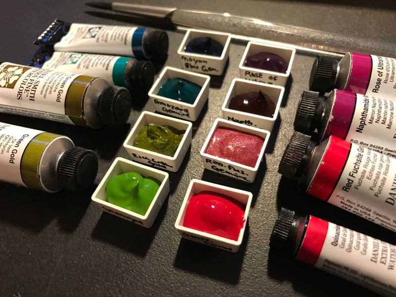
My collection is starting to look a lot more substantial and legit. Switching to more professional quality paints has been a goal of mine for a couple of years now so I’ve been collecting not only Daniel Smith but also M. Graham paints as I can to supplement my current collection of Winsor & Newton Cotman (W.N.,Cotman), Grumbacher Academy (G.A), and Van Gogh (V.G) paints (which are all student grade). After over a decade of watercolor painting, I think this is only logical.
Because so many of the Daniel Smith and M. Graham paints that I currently own contain pigments that granulate or stimulate different effects, I was unsure of how these would interact with the cheaper (and frequently synthetic) paints I more commonly use.
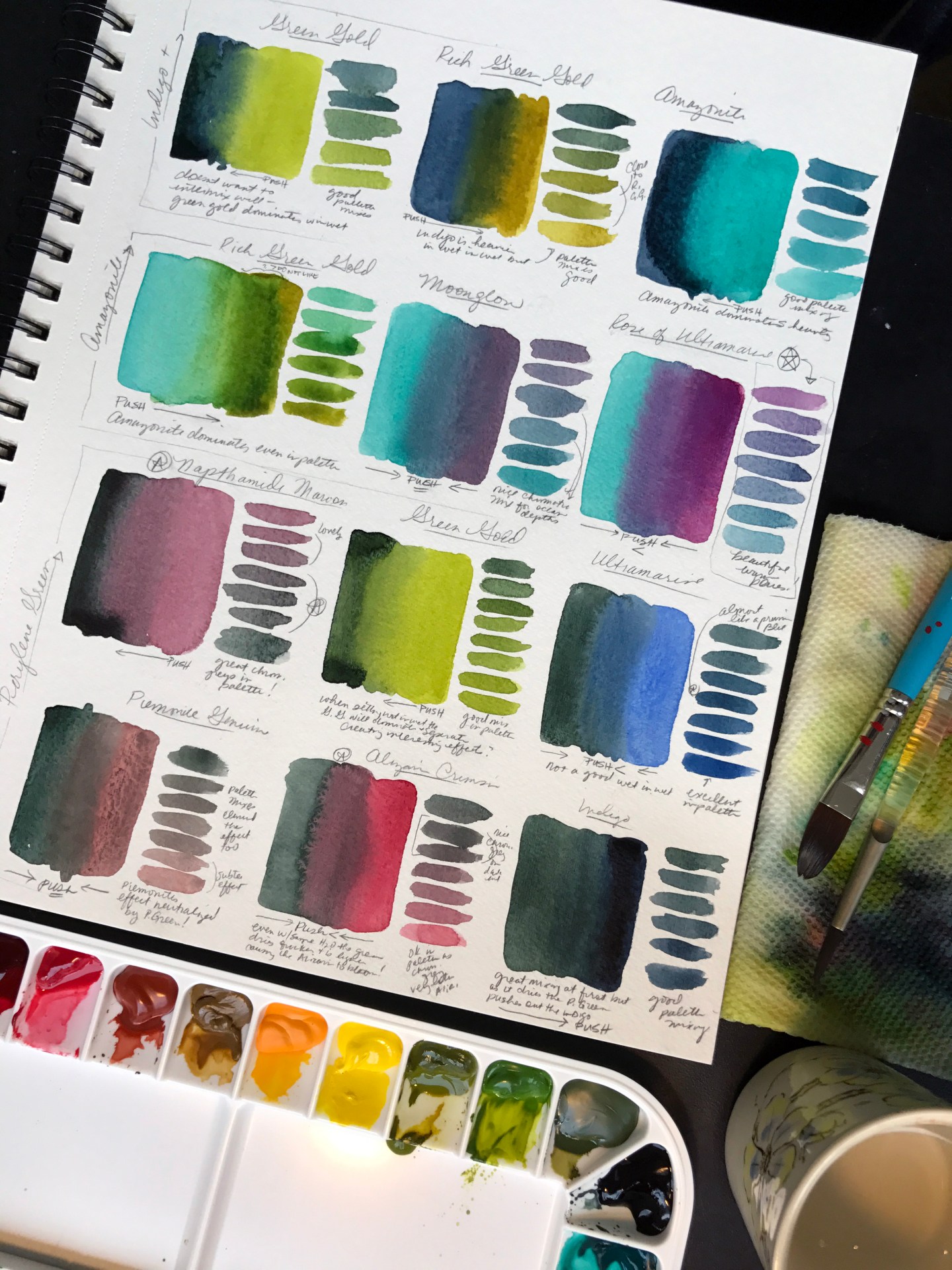
I laid out a combination of warm colors vs. cool colors in my first chart. This enabled me to test a lot of my most favorite colors and see how different brands interacted with one another. I then decided to further push the high-end paints, specifically, by testing them with the staples of my previous palette and a couple of colors I was still not sure about integrating with the new palette. The results were very unexpected!
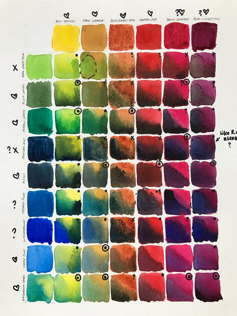
What I found is that some of the more intense M. Graham colors like Ultramarine, Prussian Blue, Phthalo Blue, and Quinocridone Violet had a hard time working with opposite temperature colors in general, regardless of brand. Equally strong (and staining) colors like Phthalo Green and Napthol Red didn’t seem to have the same issues with their counterparts. I found that Quinocridone Violet actually pushed out weird components of other colors as it dried? The tube that I own was gifted to me and is probably quite a bit older than the other tubes I have from M. Graham so perhaps this is an anomaly? I can see where this effect might be interesting at some point but it’s good to make note of this now as it would really suck to see this happen on a bigger work later on.
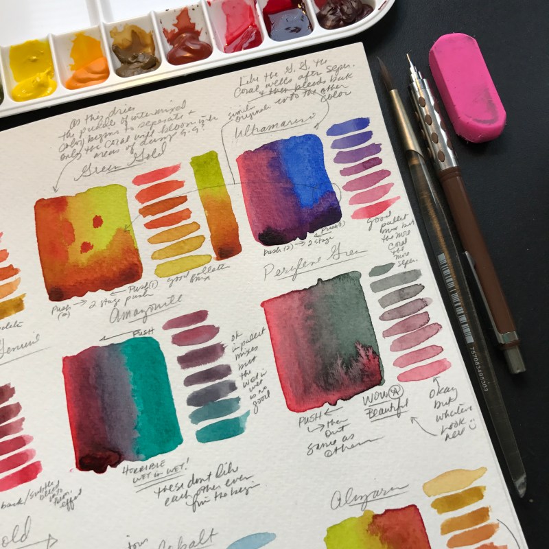
The color combinations that I unexpectedly found myself most drawn to involved the brighter Thalo Crimson and Magnesium Green (both from Grumbacher Academy, both old tubes – I’m not sure if they’re still in circulation or not). These colors roughly approximate the new tubes I just purchased from Daniel Smith: Amazonite Genuine and Quinocridone Coral. This led to a side-by-side comparison of not only these but also other suspected comparable colors: Pthalo Blue and Ultramarine Blue (both from M. Graham) and also Napthol Red (M.G) and the good old Alizarin Crimson (WN, Cotman).

This type of color test is very different than a grid and, in my opinion, not a substitute by any means. It was a fun and more organic way to determine the actual functionality of different colors. This was helpful in determining which color bias worked for me. For example, I found that despite being more interested in Pthalo Blue than Ultramarine was a better choice for me because, although Pthalo Blue created better greens it stained far more quickly. Ultramarine was a bit more combative with other colors when applied wet-in-wet but I liked the mixtures that resulted after combining it with other Daniel Smith pigments. I still think that the Pthalo Blue combinations dried smoother and with less granulation so the conclusion was to put Ultramarine in my palette but throw the Pthalo tube in my “extras” box for handy access if I want to insure less granulation in a brighter green mixture created in palette as opposed to wet-into-wet.
I also decided to keep the cheaper Alizarin Crimson rather than upgrade to the M. Graham’s Napthol Red after noticing that the Alizarin mixed better with many of the other Daniel Smith and M. Graham paints. The Napthol Red granulated in a muddy way with the same colors that joyfully merged with the Alizarin. (It’s important to note that I’m not using an Alizarin Hue here.) I particularly enjoyed the way that the Alizarin combined with the Daniel Smith Perylene Green to create a very nice deep chromatic grey/black with a warm violet undertone. I also loved how this combined with M. Graham’s Ultramarine to create a beautiful spectrum of feathered violets that compare considerably to Daniel Smith’s Rose of Ultramarine.

Thankfully, I liked both the Amazonite Genuine and Quinocridone Coral tubes by Daniel Smith as replacements to the possibly discontinued Magnesium Green and Thalo Crimson by Grumbacher Academy. Despite this, I would consider keeping the warmer Thalo Crimson in my “extras” box because it combined better with the Amazonite Genuine than Daniel Smith’s own Quinocridone Coral?! I also think it made a lovely orange with Daniel Smith’s Rich Green Gold (where as the same color mixed with the D.S. Quinacridone Coral resulted in a muddy green). That said, I really love Magnesium Green – its richer and more muted than Amazonite so I don’t really consider it a true replacement. It has lighter minerals in it than the Amazonite so it seems to interact more smoothly with a lot of the student quality paints that I have (another good “extras” box addition).
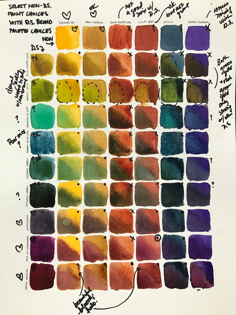
To wrap up my decisions, I had to evaluate all of my new Daniel Smith paints as a whole. Daniel Smith appears to pride themselves on some of the unique interactive effects that happen within their line so I was excited to see the results when I mixed them all together. This grid chart is probably one of the more common ones painters use and I’ll be using it a lot as a reference while painting.
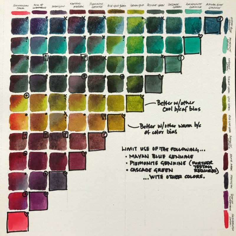
Daniel Smith colors certainly did mix a LOT better with one another when compared to the results I’d previously witnessed with the student-grade paints. There were far less “wtf?” moments and much more “ooh!” moments overall. I really loved the combinations which included either Quinocridone Coral or Perylene Green. I was a little disappointed by how difficult the Mayan Blue Genuine was overall. It was the worst performer of the tubes I now own (though it was nice with Amazonite Genuine and Green Gold). I think that my favorite colors (in their own right and because of their mixing capacity) are the Naphthamide Maroon, Moonglow, Rose of Ultramarine, and Quinocridone Coral – this is a big surprise to me because until now I didn’t think I liked many warm colors at all! (What was I thinking?)
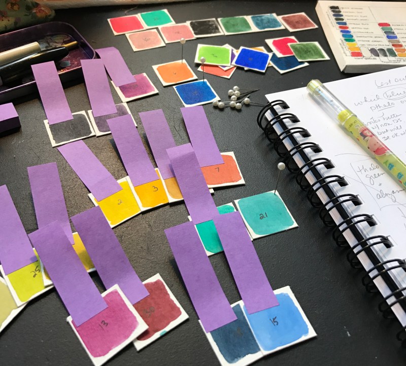
Several hours and multiple paint samples later…. (seriously, once you get into this it’s a little addictive)…

I narrowed down my palette choices significantly after these tests. I learned that my beloved Indigo is still at the top of my go-to list (thank goodness!) and that Raw Sienna is a lot less muddy than Yellow Ocher when combined with the professional quality pigments. I decided to nix Thalo Green, Quinocridone Burnt Orange, and Cadmium Red and Yellow (in all their forms) from my new palette altogether despite relying on all of these a great deal for over a decade (which is a little scary).
As a way to resolve my fears about leaving my old friends behind I decided to show a little love to my “class demo” palette by creating a little key insert to help me ID colors more easily. I also did this for my new watercolor palette and prepared all of the newly selected colors in my new empty palette.
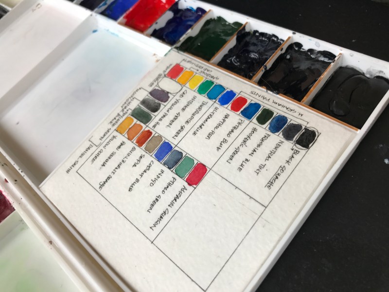
My new 2017 (and beyond) palette now integrates higher quality professional paints with a few irreplaceable student-grade ones and provides a spectrum of colors and temperatures that will hopefully provide a great deal of happy inspiration and excitement in the coming year.
 My new color list includes the following key 18 colors (in this order from left to right): Ultramarine Blue (M.G.), Cobalt Blue (W.N., Cotman), Amazonite Genuine (D.S.), Perylene Green (D.S), Olive Green (V.G.), Green Gold (D.S), Rich Green Gold (D.S), Azo Yellow (M.G.), Gamboge (G.A.), Raw Sienna (V.G.), Light Red (G.A.), Quinocridone Coral (D.S.), Alizarin Crimson (W.N., Cotman), Perylene Maroon (G.A.), Naphthamide Maroon (D.S.), Quinocridone Violet (M.G.), Moonglow (D.S.), and a Neutral Tint (M.G). I added 3 half pans containing Cascade Green (D.S.), Lunar Black (D.S.), and Piemonite Genuine (D.S.), as well as 2 full pans of Rose of Ultramarine (D.S.) and Indigo (W.N., Cotman).
I’m relieved (and exhausted) and looking forward to painting something a little more challenging than a grid next week!
(Update… I just purchased 3 new colors… I might possibly have a problem… do they have AA for artists?)
Lol this was such a good read. My friend just gifted me a set of 80 (?!?) tubes from Amazon and I just bought a bunch of half pans am I cannot wait to grid-away! I’m sure the quality isn’t even student level on these tubes but it’ll give me good practice when I do finally get to my decade before I can buy real quality stuff🙃
Thanks for all the ideas and color combos to comtemplate.
I’m just beginning to learn to watercolor, and have actually spent more time swatching and downloading paintings and drawings and color charts and articles like these for inspiration (I don’t get out much – got 4 cats to take care of and that doesn’t leave a lot of time when you live alone and have to do all the chores yourself!)
Hi Kate, welcome to the “obsessed with color” club! I hope that coming up with your own swatches and color charts help inspire your own artistic creations. (Sorry for delayed reply, our house has had flu big time the past week.) Maybe you can paint imagery of your cats? They’re good models if you can catch them laying in the fall sun for an hour or so.
How did you do those more amorphous color mixing blobs? did you paint the outside colors and then wet the center, or something like that? It’s fantastic, I’d love to try it!
You intuited correctly – I did just what you described. Thanks for the comment and interest. I hope you will try it yourself, too – it’s a lot of fun to experiment like this.