
For the first week of my 52 week challenge I decided to go back to basics. I wasn’t really sure where to begin so I started by breaking in my new watercolor sketchbook with a sketch of some saw grass roots from a previous camping trip.


I also ordered the 238 paint sampler from Daniel Smith in preparation for my annual birthday art supply order and as I began to explore each of the beautiful color options offered, I had a shocking realization – I’ve never really thought about my color palette!


After going through my paints to see what I had and what needed replacing I realized that it’s been a very long time since I’ve evaluated my personal color choices (if at all). Most of the paints I have were gifted to me by a mentor or came from a couple of chance clearance sales when I scooped up a ton of tubes for $1-$2 each. I’ve always had 2-3 colors that I favor – Indigo, Quinocridone Burnt Orange, and Yellow Ochre have always been my power trio, for example. I suppose that a lot of the basic colors I learned with just became second nature for me and thinking about it beyond a few additions here and there just wasn’t natural.
For the last couple of years for my birthday I’ve purchased 3 tubes of paints from Daniel Smith (I’m a fan of their highly granulating pigments in certain lines) but the goal was not color so much as effect – Moonglow and Lunar Black my favorites so far. Combing through the choices on the 238 sample card emphasized the range of colors that I have little experience with. Have I just been under a rock?
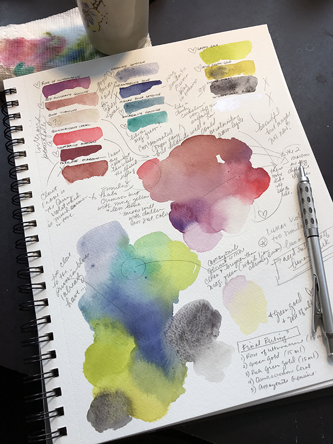
Understandable, this caused a complete re-evaluation of all of the colors in my possession. I started to make charts of all of the brands and colors I use now and then compared them against colors I was drawn to on the Daniel Smith cards. After hours of exploration I decided on 8 new colors which would provide a new foundation for a more bright and varied color palette. I’m waiting for them to arrive now… I am very excited!
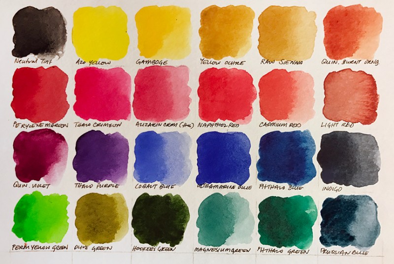
Of the colors I currently have (and there are a LOT) I settled on the following 24 as the basis of an extended palette of basics. I’m going to condense this down further when the new paints arrive this weekend.
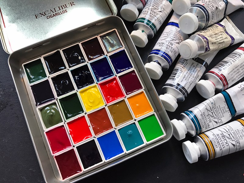
I got a little excited about the new semester starting too and, seeing as my old paint-brush roll (that I’ve had for over 10 years) had almost completely fallen apart, I made a new one – why not start the year fresh on a number of fronts?! I even started filling some of my new empty half-pans with the favored colors (boy, that’s a bitch, isn’t it?).

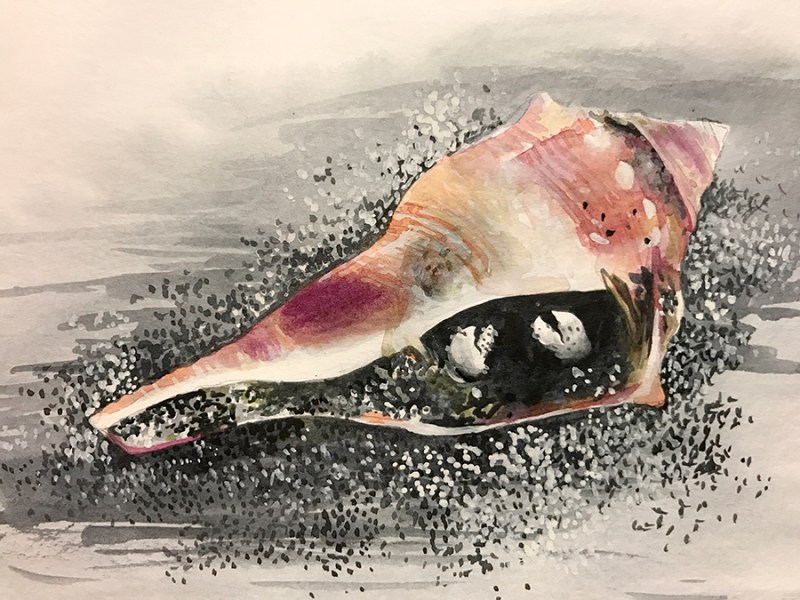
After all of this, I still hadn’t really created a work for the week… I decided on this cute little hermit crab to start with. I’ve drawn a lot of crabs but I’ve rarely tried to paint them. I don’t know how I want to handle shells and beach items – I don’t know what style I’m shooting for yet. So I’m going to play around with different things.

I almost always start paintings with a value layer. Grisaille enables me to build the forms before I pull in color and while I quite like this method I’m not sure how I feel about this anymore. I think I’d like to explore alternative methods of painting at some point this year. I’m not 100% happy with it, honestly. There is much to be improved and I feel very rusty.
And there you have it – Week 1 down. Only 51 more to go… I think I’d say I’ve gotten off to a decent start and I’ve only made myself more excited about the coming year in the process so that’s some good momentum that I hope to hold onto in the coming weeks.

I envy your ability to be able to devote so much thought and money to buying that many tubes of paint at once! The few times I’ve bought more than one or twoas replacements for colors I already have, it’s taken me literally months to make up my mind. I bought the DS 238 dot card last year and did them.
Found that the ‘genuine’ colors (like purpurite and amazonite in particular) are very unsaturated, and it takes a LOT of paint to get the shade I want. I bought the amazonite in particular for blue robin’s eggs, and found that viridian actually worked better.
I love the DM dot card – it was what I gravitated to at first as well. I think that making a palette was a really important thing for me. I’ve now used the same palette for years and it’s brought be great joy. Good luck choosing and enjoying colors.
Hi Megan, I love your brush bag. It looks like something handmade. May I ask where you got it?
I made it! Thank you so much for commenting on it. I love it a lot and it’s nice to know it caught your eye. Making them is fairly easy and there are a lot of tutorials online. I would encourage you to try to make one because you can make it exactly what you need.