A couple of months before our move I accepted a commission from an old friend, Kate, who’s getting married later this year. I’ve known Kate since I was 15, we worked together at my very first job at a local teen center. It’s great to see her and her family so happy to celebrate a new union.
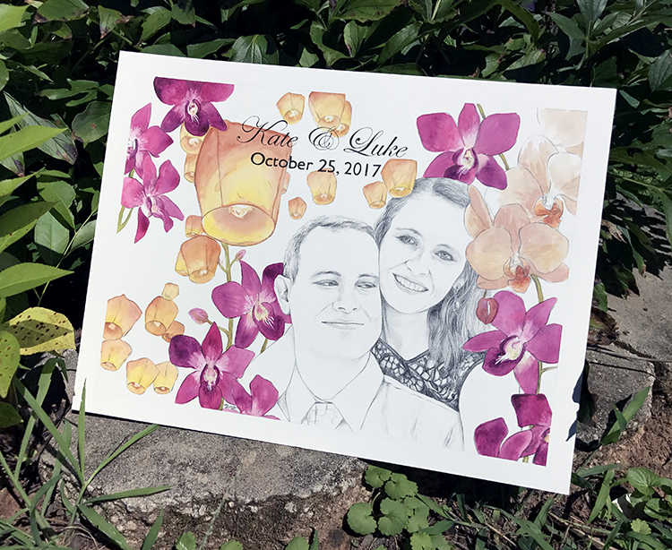
Kate’s wedding theme includes beautiful fuchsia Dendrobium orchids and beige orchids. She specifically requested the inclusion of paper lanterns and provided a lot of great visual references for me to work with. The end goal was to have a wedding portrait that was about 11×14 that could be framed to hang over a mantel AND some digital images that could be used as the backdrop for some wedding invites.

I was happy when Kate chose my favorite of the options I suggested but I have to be honest… painting orchids was a bit intimidating and I didn’t know if I’d be able to pull off the delicate forms and their super bright color or not (as evident from my earlier attempts to paint flowers this year which tend to get too dark, too quick).
In the frustration of the move (i.e. my stuff being packed by other people in boxes not labelled very well and therefor deposited in the wrong places) I lost track of where some of my supplies went and it took me a little longer to get going than expected. My new studio space (still largely in boxes at this point) was quite comfortable and in the end, I managed to pull it all together in about a week.
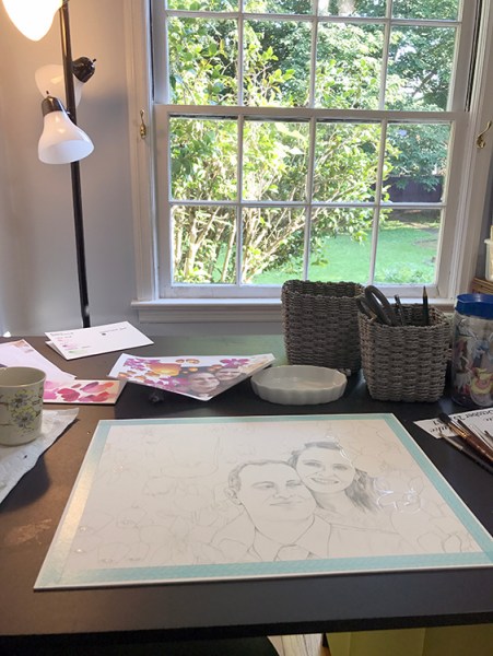
My game plan was to do the entire portrait in watercolor and ink at the beginning but the photo reference that was provided was black and white and the timelessness of it was so lovely I felt color would somehow spoil the idea of their moment living on forever.

In the end I decided to work with watercolor and graphite for the portrait – a much easier media to achieve gentle value transitions with – for a more romantic feeling.

I played around a lot with fuchsia colors, looking for the exact right combo that not only had great color but also separated correctly across the surface of the petals. I settled on Thalo Crimson (Winsor & Newton) and Rose of Ultramarine (Daniel Smith) and the choice was exactly what I wanted.
I photographed the work prior to adding the names of the couple and their wedding date in ink so that the section to the far left could be used as a background for invites. The idea is that the composition can be cropped down from its original 11×15 a bit with a mat when framed.

The work arrived safely with the following tiny thank you painting and a few business cards. I’m glad to have taken the commission request despite all that was going on with the move. Thinking about the joy that the future holds for each of us helped me step back into the studio despite all the upheaval in my life at the moment – there is much to look forward to.


Beautiful!! 😍
Thanks! 🙂